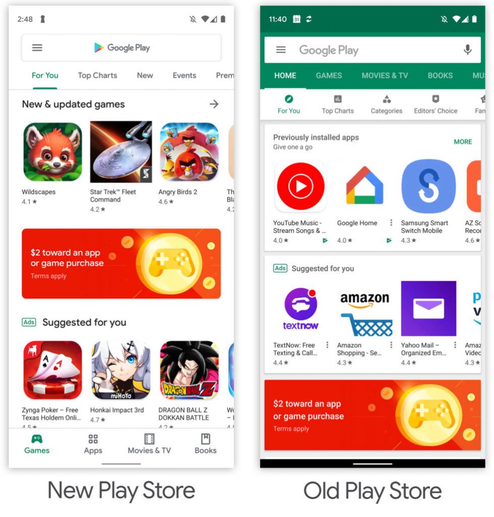
Google has begun offering massive redesign of the Google Play Store to users. This design has appeared several times in limited testing in the past few months, but already now is available to everyone.
The new look is in line with the “Material Design” that Google brought with Android 9 Pie last year. This style uses the official Google.com site as inspiration and the results are very white.
It’s the same design released in Gmail earlier this year, present on Android P and will continue with Android Q.
The Play Store sells apps, books, movies, and music, and past design was colorful between different sections. Now the app is almost monochrome.
In addition to the new look, the app offers support for the new gesture navigation panel by making it transparent. On the homepage, the content tabs are at the bottom of the app. The four tabs remain “Games”, “Apps”, “Movies & TV” and “Books” while the “Music” tab is missing.
Along with the Play Store, we expect to see successive redesign with Google apps in the coming weeks. The company has promised a “Dark Mode” for everyone, a feature that will be available at system level on Android Q as well.
> Read Next: Technology giants together against the digital tax
So what do you think about this? Let us know your thoughts in the comments section below, follow us on twitter and facebook for more news and updates.

